- 개요
방금 전에 8번째 포스트를 마쳤는데 어째다보니 작업이 금방 끝나서
기상청 ASOS/AWS 그래프 따라 그리기의 마지막 포스트를 연재합니다.
오늘은 그리드 라인을 그리고, 배경색을 회색으로 변경하겠습니다.
- 그리드 라인 그리기 및 회색 배경
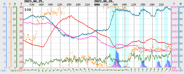
원본에서 그리드 라인이 어떻게 그려졌는지 확인해봅시다.
아래의 원본을 보시면 세로 선은 3시간 간격으로 그려져 있고 00시는 검정색, 나머지 시간에서는 회색입니다.
가로 선은 ytick라벨이 적힌 곳에 그려져 있습니다.
모두 회색이며 중간에 위치하는 선만 실선 나머지는 dashed line입니다.
마지막으로 원본의 배경색은 회색입니다.
matplotlib에서는 gridline을 그리는 옵션이 따로 있긴 하지만
저는 ax.axvline과 axhline을 사용하겠습니다
ax.axvline은 vertical line(세로 선)을, ax.axhline은 horizontal(가로 선)을 그리는 메서드입니다.
배경색은 fig.patch.set_facecolor로 변경합니다.
그럼 전체 코드를 확인해보죠.
import matplotlib.pyplot as plt

df['WS10'][df['WS10'] == -99.9] = np.NaN


color_TA = 'red'
color_PS = (255./255., 51./255., 204./255.)
color_HM = (0, 102./255., 153/255.)
color_WS = (50./255., 108./255., 17./255.)
color_WD = (255./255., 153./255., 51./255.)
color_RN60 = (102./255., 153./255., 1.)
color_RN15 = (1., 153./255., 1.)
color_RE = (204./255., 255./255., 255./255.)

# 강수 > 온도 > 현지기압 > 습도 > 풍속 > 풍향
fig = plt.figure(figsize=(13,5))
"""
배경색을 회색으로 변경함
"""
fig.patch.set_facecolor((234./255., 234./255., 234./255.))

varnames = ['RN-60m', 'TA', 'PS', 'HM', 'WS10', 'WD10']
colors = [color_RN60, color_TA, color_PS, color_HM, color_WS, color_WD]
ymins = [0, 16, 999, 0, 0, 90]
ymaxs = [40, 36, 1019, 100, 20, 90+360]
dys = [4, 2, 2, 10, 2, 90]

direction = [True, True, False, False, True, True]
direction_str = ['left' if i == True else 'right' for i in direction]
direction_str_reverse = ['right' if i == True else 'left' for i in direction]
spine_set_positions = [70, 0, 0, 35, 25, 50]

ano_varname = ['R', 'T', 'P', 'H', 'S', 'W']
y0_ano = 1.03
xys_varname =[(-0.115, y0_ano), (-0.015, y0_ano), (1.015, y0_ano), (1.055, y0_ano), (-0.048, y0_ano), (-0.086, y0_ano)]

ano_unit = ['(mm)', '(C)', '(hPa)', '(%)', '(m/s)', '']
y0_ano = -0.05
xys_unit = [(xys[0]-0.005, y0_ano) for xys in xys_varname]

for i, varname in enumerate(varnames):
    if varname == 'RN-60m':
        ax_base = fig.add_subplot()
        ax = ax_base
        x = range(len(df[varname]))
        dx = x[1] - x[0]
        ax.bar(x, df['RE']*40, color=color_RE, width=dx)
        ax.bar(x, df[varname], color=colors[i], width=dx)
        ax.bar(x, df['RN-15m'], color=color_RN15, width=dx)

        ax.set_xlim(x[0], x[-1])
        ax.tick_params(axis='x', which='both', length=0)
        df['datetime'] = pd.to_datetime(df['OBS_TM'], format='%Y%m%d%H%M')
        df['hour'] = df['datetime'].dt.strftime('%H').astype(int)
        df['minute'] = df['datetime'].dt.strftime('%M').astype(int)
        xtick_condition = (df['hour'] % 3 == 0) & (df['minute'] == 0)
        xtick_index = np.where(xtick_condition)[0]

        ax.set_xticklabels([])
        ax.xaxis.set_ticks_position('top')
        ax.xaxis.set_label_position('top')

        xticks = []
        xticklabels = []
        xticklabels_bold = []


        for xind in xtick_index:
            xticks.append(x[xind])
            if x[xind] > 18 and x[xind] < len(x) - 18:
                xticklabel = f'{df.iloc[xind]['hour']:02}H'
                xticklabels.append(xticklabel)

            else:
                xticklabels.append('')

            if df.iloc[xind]['hour'] == 0:
                xticklabels_bold.append(True)
            else:
                xticklabels_bold.append(False)

        """
        xtick label을 적는 그리는 부분에서 x 좌표를 받아올 것이므로
        세로 선은 xtick label과 함께 그립니다.
        """
        for tickind, (tick_pos, tick_label) in enumerate(zip(xticks, xticklabels)):
            if xticklabels_bold[tickind]:
                ax.text(tick_pos, 42, tick_label, ha='center', va='top', fontweight='bold')
                ax.text(tick_pos + dx*16, 44, df.iloc[tick_pos]['datetime'].strftime('%Y.%m.%d'), ha='center', va='top', fontweight='bold')
                ax.axvline(x=tick_pos, color='black', lw=0.7) # 00시의 검은 실선
            else:
                ax.text(tick_pos, 42, tick_label, ha='center', va='top', fontweight='normal')
                ax.axvline(x=tick_pos, color='gray', lw=0.7) # 00시 이외 시간의 회색 실선
        """
        가로 선의 위치는 yick label 위치와 동일합니다.
        linestyle=(0, (5, 10)로 설정하면 적당히 간격이 넓은 dashed line을 그립니다.
        y=20은 y축은 중간 위치로 여긴 실선으로 그립니다.
        """
        for y_pos in range(ymins[i], ymaxs[i]+1, dys[i]):
            ax.axhline(y=y_pos, color='gray', lw=0.7, linestyle=(0, (5,10)))
        ax.axhline(y=20, color='gray', lw=0.7)

        # 관측소 번호
        ax.text(18, 38, '108', weight='bold', fontsize=14, ha='center', va='center')

    else:
        if varname == 'WD10':
            df.loc[df[varname] < 90, varname] += 360
            ax = ax_base.twinx()
            ax.scatter(x, df[varname], color=colors[i], s=4)

        else:
            ax = ax_base.twinx()
            ax.plot(x, df[varname], color=colors[i], lw=1)

    ymin, ymax, dy = ymins[i], ymaxs[i], dys[i]
    ax.set_ylim(ymin, ymax)
    ax.set_yticks(range(ymin, ymax+1, dy))


    if varname == 'WD10':
        ax.set_yticklabels(['E', 'S', 'W', 'N', 'E'])

    ax.spines[direction_str[i]].set_position(('outward', spine_set_positions[i]))
    ax.spines[direction_str_reverse[i]].set_visible(False)

    ax.yaxis.set_ticks_position(direction_str[i])
    ax.yaxis.set_label_position(direction_str[i])

    ax.tick_params(axis='y', which='both', length=0)
    ax.tick_params(axis='y', labelcolor=colors[i])
    if varname == 'TA' or varname == 'PS':
        ax.spines[direction_str[i]].set_color('gray')
        ax.spines[direction_str[i]].set_linewidth(2)
    else:
        ax.spines[direction_str[i]].set_color(colors[i])
        ax.spines[direction_str[i]].set_linewidth(2)

    ax.annotate(ano_varname[i], xy=xys_varname[i], xycoords='axes fraction', color=colors[i], fontsize=10, fontweight='bold')
    ax.annotate(ano_unit[i], xy=xys_unit[i], xycoords='axes fraction', color=colors[i], fontsize=9)


def xypoint_to_axesfrac(ax, loc):
    x, y = loc
    trans = ax.transData
    inv_trans = ax.transAxes.inverted()
    xdata, ydata = trans.transform((x, y))
    xdata, ydata = inv_trans.transform((xdata, ydata))
    return xdata, ydata

arrowprops=dict(color=color_WS, arrowstyle='->')
x_pos_arrow = range(0, 575, 18)
WD10 = df['WD10'].to_list()
arrow_start = []
arrow_end = []
pi = np.pi
length = 23./2.

for xx in x_pos_arrow:
    centery = (88. + 65.) * 0.5
    centerx = xx
    arrow_start.append((centerx + length*np.sin(2*pi*WD10[xx]/360.),
                        centery + length*np.cos(2*pi*WD10[xx]/360.)))
    arrow_end.append((centerx - length*np.sin(2*pi*WD10[xx]/360.),
                        centery - length*np.cos(2*pi*WD10[xx]/360.)))


for ind_arrow in range(len(arrow_start)):
    ax.annotate('', xy=xypoint_to_axesfrac(ax, arrow_end[ind_arrow]),
                xytext=xypoint_to_axesfrac(ax, arrow_start[ind_arrow]), xycoords='axes fraction', arrowprops=arrowprops, ha='center')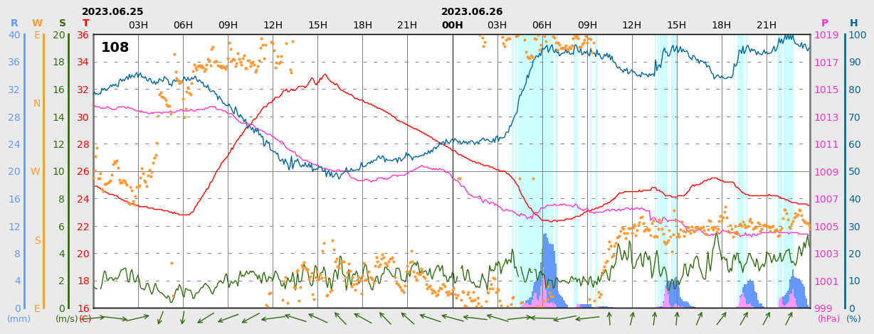
글씨체가 좀 다르긴 하지만 원본과 아주 비슷합니다.
이것으로 기상청 ASOS/AWS 따라그리기의 연재를 마치겠습니다.
'대기과학 > 프로그래밍' 카테고리의 다른 글
| [Matplotlib] 기후 나선 그리기 1: NASA Climate Change 그림 설명 및 사용할 자료 설명 (0) | 2024.09.19 |
|---|---|
| [Matplotlib] 기후 나선 그리기 0: 프롤로그 (4) | 2024.09.11 |
| [Matplotlib] 기상청 ASOS/AWS 그래프 따라 그리기 8: 바람 벡터 넣기 (0) | 2024.08.02 |
| [Matplotlib] 기상청 ASOS/AWS 그래프 따라 그리기 7: x축 라벨 적기 (0) | 2024.07.25 |
| [Matplotlib] 기상청 ASOS/AWS 그래프 따라 그리기 6: y축 제목, 단위 적기 (2) | 2024.07.23 |