- 개요
저번 포스트에서는 변수 하나씩 그래프로 그렸던 작업을 for문으로 바꾸어 코드를 짧게 만들어 보았습니다.
이렇게 for문으로 바꾸면 함수화하기 쉬워지므로 유지/보수 및 자동화가 쉬워집니다.
이번에는 y축 제목 및 단위를 적어보겠습니다. 지금까지 포스트 중에서 가장 간단한 일이 될 듯합니다.
- annotate() 메서드 사용
전 annotate()를 써서 y축 제목과 단위를 적겠습니다.
참고로 text() 메서드를 써도 무방합니다.
annotate()와 text()의 주요 차이점은 좌표계 설정 방법이고, 제 생각에 annotate가 더 다루기 쉽습니다.
annotate는 xycoords 키워드를 통해 좌표계를 설정하고, text는 transform 키워드로 좌표설정을 합니다.
annotate 사용 예시
ax.annotate('원하는 글자', xy=(x좌표, y좌표), xycoords='axes fraction', color=글자색, fontsize=글자크기)
위의 예시에서 annotate는 좌표계를 'axes fraction'으로 설정했습니다.
이 설정에서는 xy=(0, 0)을 넣으면 x축과 y축의 시작점에 글씨가 써지고, (1,1)을 넣으면 x축과 y축의 끝점에 글씨가 써집니다.
참고로 0보다 작은 값, 1보다 큰 값을 넣으면 축을 벗어나는 위치에도 글자를 적을 수 있습니다.
- y축, 단위 적기
import matplotlib.pyplot as plt

df['WS10'][df['WS10'] == -99.9] = np.NaN


color_TA = 'red'
color_PS = (255./255., 51./255., 204./255.)
color_HM = (0, 102./255., 153/255.)
color_WS = (50./255., 108./255., 17./255.)
color_WD = (255./255., 153./255., 51./255.)
color_RN60 = (102./255., 153./255., 1.)
color_RN15 = (1., 153./255., 1.)
color_RE = (204./255., 255./255., 255./255.)

# 강수 > 온도 > 현지기압 > 습도 > 풍속 > 풍향
fig = plt.figure(figsize=(13,5))

varnames = ['RN-60m', 'TA', 'PS', 'HM', 'WS10', 'WD10']
colors = [color_RN60, color_TA, color_PS, color_HM, color_WS, color_WD]
ymins = [0, 16, 999, 0, 0, 90]
ymaxs = [40, 36, 1019, 100, 20, 90+360]
dys = [4, 2, 2, 10, 2, 90]
# True는 왼쪽 y축, False는 오른쪽 y축
direction = [True, True, False, False, True, True]
direction_str = ['left' if i == True else 'right' for i in direction]
direction_str_reverse = ['right' if i == True else 'left' for i in direction]
spine_set_positions = [70, 0, 0, 35, 25, 50]


"""
ano는 적을 글자, xys는 적을 글자의 x, y좌표를 설정합니다.
varname로는 y축 위에 변수 이름, unit에서는 y축 아래에 적힌 단위를 적고자 합니다.
"""
ano_varname = ['R', 'T', 'P', 'H', 'S', 'W']
y0_ano = 1.03
xys_varname =[(-0.115, y0_ano), (-0.015, y0_ano), (1.015, y0_ano), (1.055, y0_ano), (-0.048, y0_ano), (-0.086, y0_ano)]

y0_ano = -0.05
ano_unit = ['(mm)', '(C)', '(hPa)', '(%)', '(m/s)', '']
xys_unit = [(xys[0]-0.005, y0_ano) for xys in xys_varname]


for i, varname in enumerate(varnames):
    if varname == 'RN-60m':
        ax_base = fig.add_subplot()
        ax = ax_base
        x = range(len(df[varname]))
        dx = x[1] - x[0]
        ax.bar(x, df['RE']*40, color=color_RE, width=dx)
        ax.bar(x, df[varname], color=colors[i], width=dx)
        ax.bar(x, df['RN-15m'], color=color_RN15, width=dx)

    else:
        if varname == 'WD10':
            df.loc[df[varname] < 90, varname] += 360
            ax = ax_base.twinx()
            ax.scatter(x, df[varname], color=colors[i], s=4)

        else:
            ax = ax_base.twinx()
            ax.plot(x, df[varname], color=colors[i], lw=1)

    ymin, ymax, dy = ymins[i], ymaxs[i], dys[i]
    ax.set_ylim(ymin, ymax)
    ax.set_yticks(range(ymin, ymax+1, dy))

    if varname == 'WD10':
        ax.set_yticklabels(['E', 'S', 'W', 'N', 'E'])

    ax.spines[direction_str[i]].set_position(('outward', spine_set_positions[i]))
    ax.spines[direction_str_reverse[i]].set_visible(False)

    ax.yaxis.set_ticks_position(direction_str[i])
    ax.yaxis.set_label_position(direction_str[i])

    ax.tick_params(axis='y', which='both', length=0)
    ax.tick_params(axis='y', labelcolor=colors[i])
    if varname == 'TA' or varname == 'PS':
        ax.spines[direction_str[i]].set_color('gray')
        ax.spines[direction_str[i]].set_linewidth(2)

    else:
        ax.spines[direction_str[i]].set_color(colors[i])
        ax.spines[direction_str[i]].set_linewidth(2)
    # y축 위의 변수 이름을 적음
    ax.annotate(ano_varname[i], xy=xys_varname[i], xycoords='axes fraction', color=colors[i], fontsize=10, fontweight='bold')
    # y축 아래의 단위를 적음
    ax.annotate(ano_unit[i], xy=xys_unit[i], xycoords='axes fraction', color=colors[i], fontsize=9)
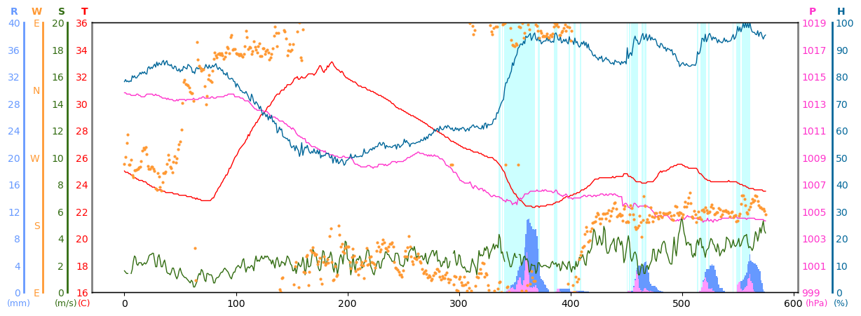
글자가 적히는 좌표는 일일히 하나씩 적어가면서 찾았습니다.
다음 포스트에서는 x축 시간 라벨을 기상청 그래프처럼 만들어보겠습니다.
'대기과학 > 프로그래밍' 카테고리의 다른 글
| [Matplotlib] 기상청 ASOS/AWS 그래프 따라 그리기 8: 바람 벡터 넣기 (0) | 2024.08.02 |
|---|---|
| [Matplotlib] 기상청 ASOS/AWS 그래프 따라 그리기 7: x축 라벨 적기 (0) | 2024.07.25 |
| [Matplotlib] 기상청 ASOS/AWS 그래프 따라 그리기 5: 반복하는 부분을 for문으로 만들기 (0) | 2024.07.19 |
| [Matplotlib] 기상청 ASOS/AWS 그래프 따라 그리기 4: y축, 축의 라벨 색 바꾸기 (0) | 2024.07.18 |
| [Matplotlib] 기상청 ASOS/AWS 그래프 따라 그리기 3: 선과 음영 그리기 (1) | 2024.07.12 |